Nextion Editor Quick Start Guide
Contents
Introduction
Nextion Editor is a development software used for visual building of graphic interface for embedded GUI-intensive devices with various types of TFT displays and Touch Panels. Using this tool you can start creating TFT based devices much faster and easier.
In the future, Nextion Editor will provide a set of examples intended to speed up your work and creation process. Examples are fully-comented and explained, thus allowing a quick start in designing user interface. Browse through the given examples and learn how to create GUI application with minimum of time and effort.
Menu and Tool Bars
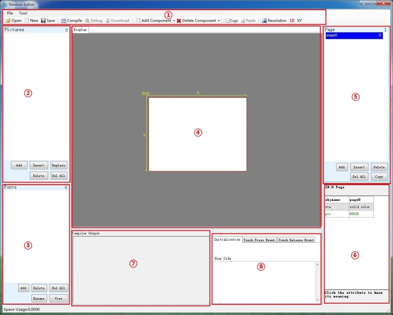
Main Interface
- 1: Main Menu
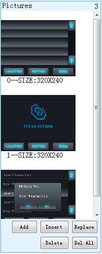
- 2. Image Library:Import the image resource you need in project.
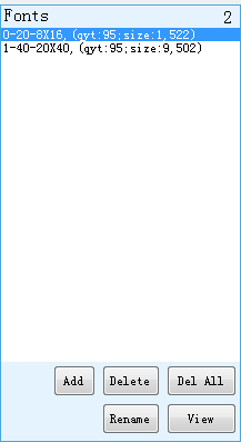
- 3. Font Library: Storage the font you made by font editor.
- 4. Working area
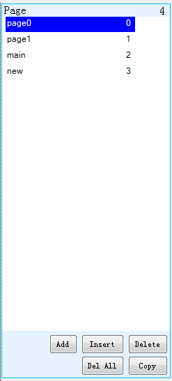
- 5. Page editing: Add or select page in this area
- 6. Attributes editing:Edit the attributes of components and pages. Like the value, color of a text components.
- 7. Warning prompt window: if errors occur, they will be shown in this area.
- 8. Even editing: Write some simple code here. When the even is triggered, the code you write will be run. Like sending out some command to UART when release a button component.
Main Menu
File
You can open/import/save projects by clicking File.
Tool
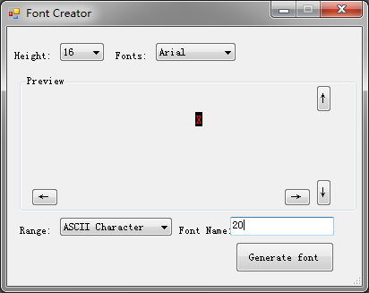
There are two tools: Font Generate & Eyedropper
After you start a project, Font generating is the foremost thing you need to do. Only doing that step, can you input characters in Text component. For now, the English Font format that Nextion Editor only supports is Arial. Please choose this Font only when you generate English font. Save it on the zi folder.
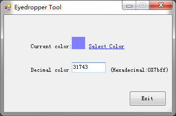
Eyedropper Tool
Actually, it is a color decimal converter. You pick a color in this tool, it will tell you the color's decimal code. This will be helpful, if you use commands to do GUI editing.
Open, New, Save
These three buttons for you open, add a new, or save project.
Compile
It is used for refresh project, not gonna save project. If you modify some attributes of a certain component, you need to click it so that your modifications can take effect.
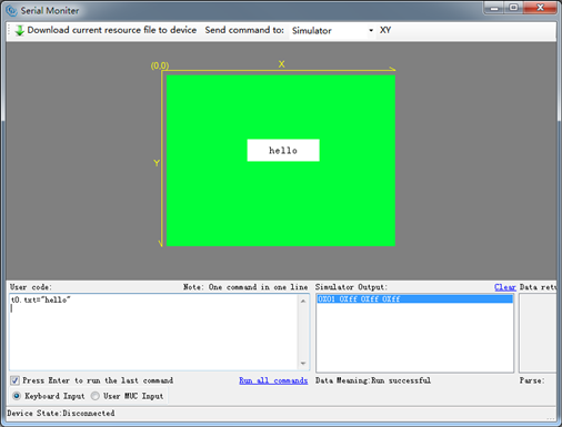
Debug
Click it, there will be a simulator pop-up window. You can test the project you've done or input codes to know whether your project is going right or not.
Download
This button is for you downloading the project into Nextion TFT board.
Add Component
So far, there are text, button, progress bar, picture, crop, gauges, touch area components available. More about these components editing guide, please see the following sections.
Delete Component
You can choose Delete All Components or Delete Selected Components.
Copy & Paste
Only used for copy or paste any component!
Resolution
Used for changing your whole project's resolution. Please note that, create a project's resolution according to your Nextion TFT boards resolution.
ID
Click ID to choose whether showing the components' IDs or not.
XY
Click XY to choose whether showing the XY coordinate or not.
Image Library
You can import the pictures in this panel by clicking Add button. Note that, every picture has its own ID number, if you insert or delete any picture, the ID number will change. But replacing picture will not change the ID number.
Font Library
Font library is very important! If you want to use different font size or patterns in your projects, you need to generate different fonts and add them in the font library panel.
(So far, font pattern only supports Arial)
For example, using 16 and 40 pounds font size in a project, you need to generate two fonts, one is 16 pounds, and the other is 40 pounds.
In the font library panel, every font has its ID number, delete any one will change its Font ID number.
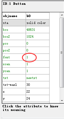
Then, what's the ID number for? When you editing the text attributes, there is a font option. The value you can input in font option is the Font ID number.
Page editing
You can add, insert, delete, and copy a page by using the bottom buttons. Double-click a page, you can define a name for a page, press enter key to save the change. Note that, only press enter key can save your define name for a page.
Working area
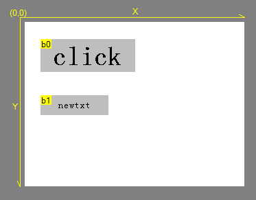
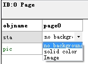
You can drag-and-drop any component in the working area. Support three background patterns: no background, solid color, and Image.
Components
So far, there are seven components available in Nextion editor. We will introduce their features one by one. Note that, only attributes in green color are available to use commands to edit.
- Nextion Editor is not perfect, is improving now. We are welcome any suggestions, don't hesitate to judge us in our forum!
Text
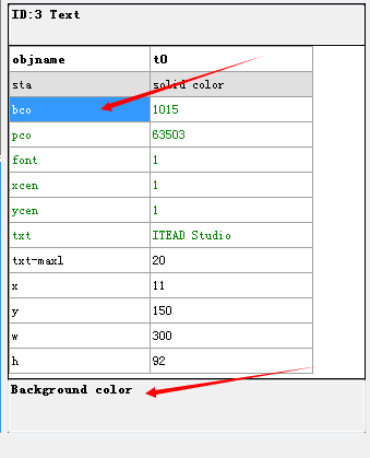
Text component is for user inputting characters. Click each attribute, its meaning will be shown on the bottom.
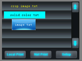
In sta attribute, you can choose different background pattern: crop image, solid color, and Image. Generally, crop image is for creating transparent background.
Button
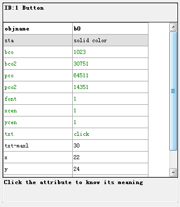
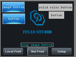
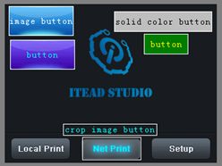
Compare to text component, Button has a press event attribute, which means you can fill different color or effect for a button when it is being pressed.
- Button Attribute set
| Button being pressed before
|
Button being pressed
|
 |
 |
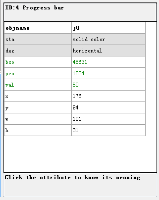
Progress Bar
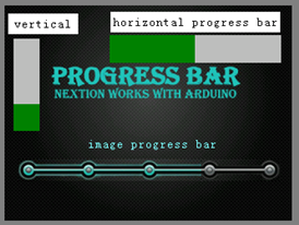
Progress Bar doesn't has many attributes, and you can create a horizontal progress bar or vertical progress bar.
Picture
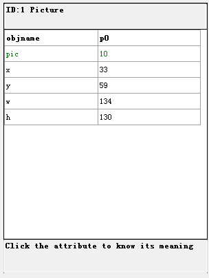
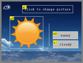
Picture can be add to your project through picture components
- Picture component Attributes set
Crop
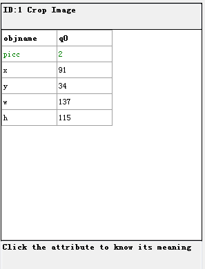
Crop component can crop a full-screen image, and show the cropped image directly on your page.
Gauges
Touch area
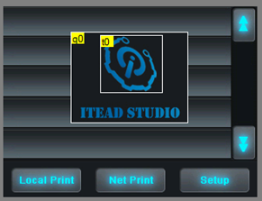
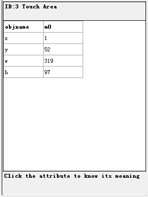
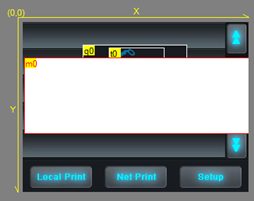
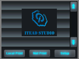
Touch area is a blank area when you editing it. However, when you debug it, it will be transparent. This component is for collecting touch coordinates, which means the touch spot coordinate in the touch area will be collected and recorded.
| Editing mode
|
Debugging mode
|
 |
 |
 Notice